
When it comes to web design, you know you need to create a positive user experience (UX). However, it’s also very easy to underestimate minor features or things a bit outside the norm. Some features work well for particular industries, and other elements perform best for others added Liam Webster, a web design agency in Wakefield.
There over more than 1.78 billion websites online, with around 200 million active at any given time. Your site must meet expectations while also offering unique features competitors’ sites do not.
Consider the aspects of basic web design. What should you include, and what is insignificant? We’ve looked at some of the most common, as well as the most uncommon web design components, and come up with seven of the best ones to include in your next creation.
1. Payment Systems
If you sell anything on your website, you need a simple way to collect payments. There are various options, such as gathering credit card information and processing through your bank’s POS options. You can also add third-party options like PayPal and even take bitcoin or other digital cash.
Check out some of the top systems’ features and figure out which ones best meet the needs of your business. If there’s already have a POS in place, can it integrate with the website? Is there a way to hook online orders to inventory tracking?
2. Readable Text
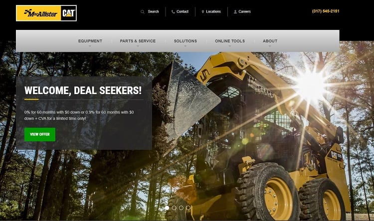
Including easily read text might sound like a no-brainer. However, you’d be surprised how many designers add a beautiful hero image in the background only to create a situation where the user can’t read the headline or body text. The most evenly colored background photo can sometimes cause typography to disappear.
Check how the text looks on both big and small screens. Look for ways to increase readability, such as darkening the background image or creating a partially transparent overlay behind the text to make the words pop.
It’s easy to forget the communication elements on a website. While you know the text should be readable, you may not always think to check it across different device types.
MacAllister Machinery uses an image of some of its equipment on the jobsite as its background image. The detailed photograph could easily obscure the text. However, it also adds a black overlay behind the header and sub-header, making it partially transparent, so the background still peeks through. The overall effect is sharp and modern looking but easy to read.
3. Limited Color Palette
Choose a color palette matching the company’s style guide. Whether marketing online on social media or creating a new website, the hues should remain consistent. Don’t try to add in a bunch of additional colors to draw attention.
While a new accent color for a call to action (CTA) button works in many instances, throwing in extra hues just to make the page colorful rarely works aesthetically. Stick with two or three primary shades so the user doesn’t feel overwhelmed, and the attention shifts toward the goal for the page.
4. Interactive Hero Images
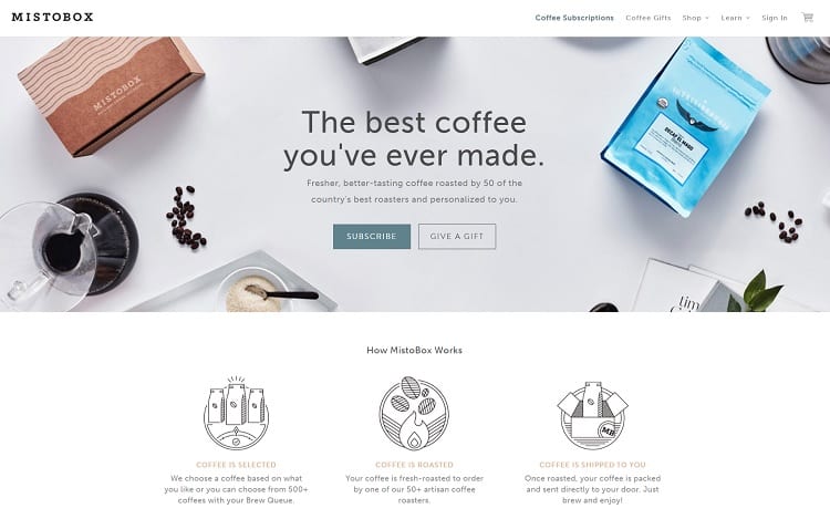
Hero images have been popular for several years now. They allow companies to put a unique twist on their homepages while still including actionable information. Rather than just placing an image in your header, though, make it interactive. Add a call to action on top of the hero image, so users click and move through the sales funnel.
It’s easy to underestimate how much attention the hero image draws. It’s above the fold and is often the first thing the user looks at after landing on your page. Capture their attention with an actionable feature.
MistoBox uses a hero photo highlighting some of its products, a few loose coffee beans and some blank space in the middle of the image. It uses the white space to add a heading, subheading and two CTAs. The first CTA is a pop of color and says “Subscribe.” The second button is transparent and invites the user to give a subscription box as a gift.
5. Informational Videos
Around 85% of businesses use video as a marketing tool, and 92% feel it’s vital to their overall promotional strategies. Users often land on your page, not knowing much about you as a business. They have no reason to trust you or that you’ll follow through on your promises. It’s your job to convince them.
People underestimate how powerful something like a video testimonial is. When buyers see you or one of your customers, they can gauge both words and body language. They make an instant decision about how trustworthy you are. They are more likely to relate to your brand when there’s both a voice and face behind it.
6. Clean Coding
It’s easy to get so caught up in the appearance of the frontend of design that you forget about the functions on the backend. If you want your user interface (UI) to work for your site visitors, you must make sure your coding is clean. Every element must work. Test your site thoroughly by clicking through on each actionable item on the page. If there are forms, fill them out and send them to make sure the user gets a confirmation, and you receive the data on the other end.
Unnecessary additions also bog down your page speeds and disrupt the user experience. People won’t wait long for a page to load before bouncing away. Do whatever you need to keep the coding simple and avoid using too many scripts.
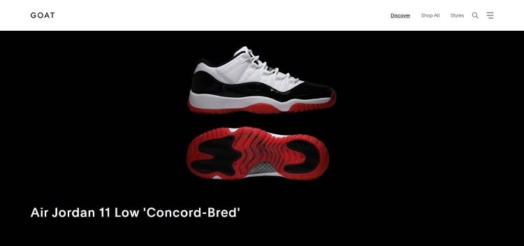
GOAT is a shopping app where people sell their lightly used sports brand apparel, such as Nike sneakers. The site has a minimalistic design keeping the pages from looking cluttered like some other used shopping websites. The product pages list the new and used price. If there are no available items, it reads “Sold Out,” saving the user time and effort.
7. Transitions
How do you move users from one part of your site to another? People often forget that buyers go through a journey when they browse your pages. There are different stages of the sales process. As you shift the user from the awareness to the interest stage, what signals to them they are moving to a new level?
There are many different ways you can transition. You can move them to a new page, push the screen up, create a sideways scrolling option or have them click on a button. Just make sure the transitions are clear and the user knows they are going forward.
Deliver a Complete Web Design Solution
Thinking about the elements impacting customers’ experiences on your website puts you a step ahead of other designers. Your clients will see that you care about form and function. The best-designed sites combine beautiful imagery and expected features with new technology and usability.
Lexie is a UX designer and IoT enthusiast. She enjoys hiking her goldendoodle and creating new fudge recipes. Visit her design blog, Design Roast, and connect with her on Twitter @lexieludesigner.